( Bosta · Consultation · Egypt )
Redesigning the Bosta home screen.
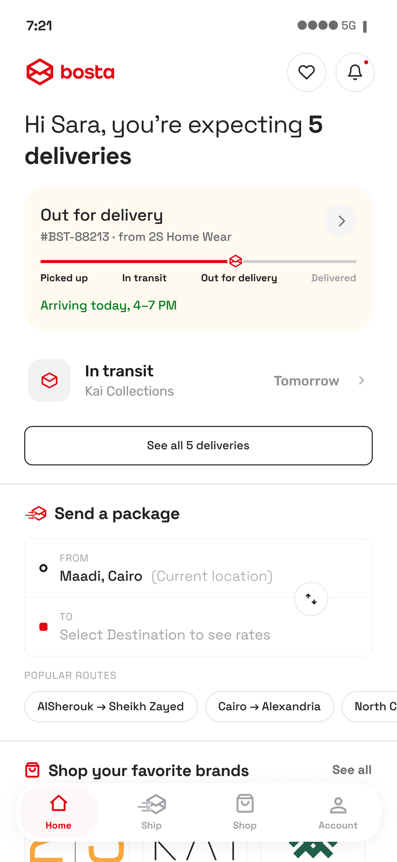
Bosta is an Egyptian shipping and last mile delivery company. Their consumer app worked, but it read like an internal tool: no logo, barely any brand colour, and copy written from the company's side. The business was also expanding into commerce, selling the brands it already delivers for, and the home screen had to carry both without either one displacing the other.
problems found in the audit, each with a decision that answers it
button deleted, with the reassurance it carried moved into the field itself
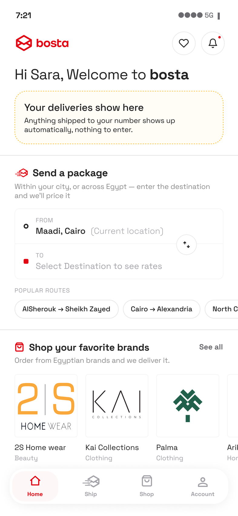
separate onboarding screens. The product teaches itself instead
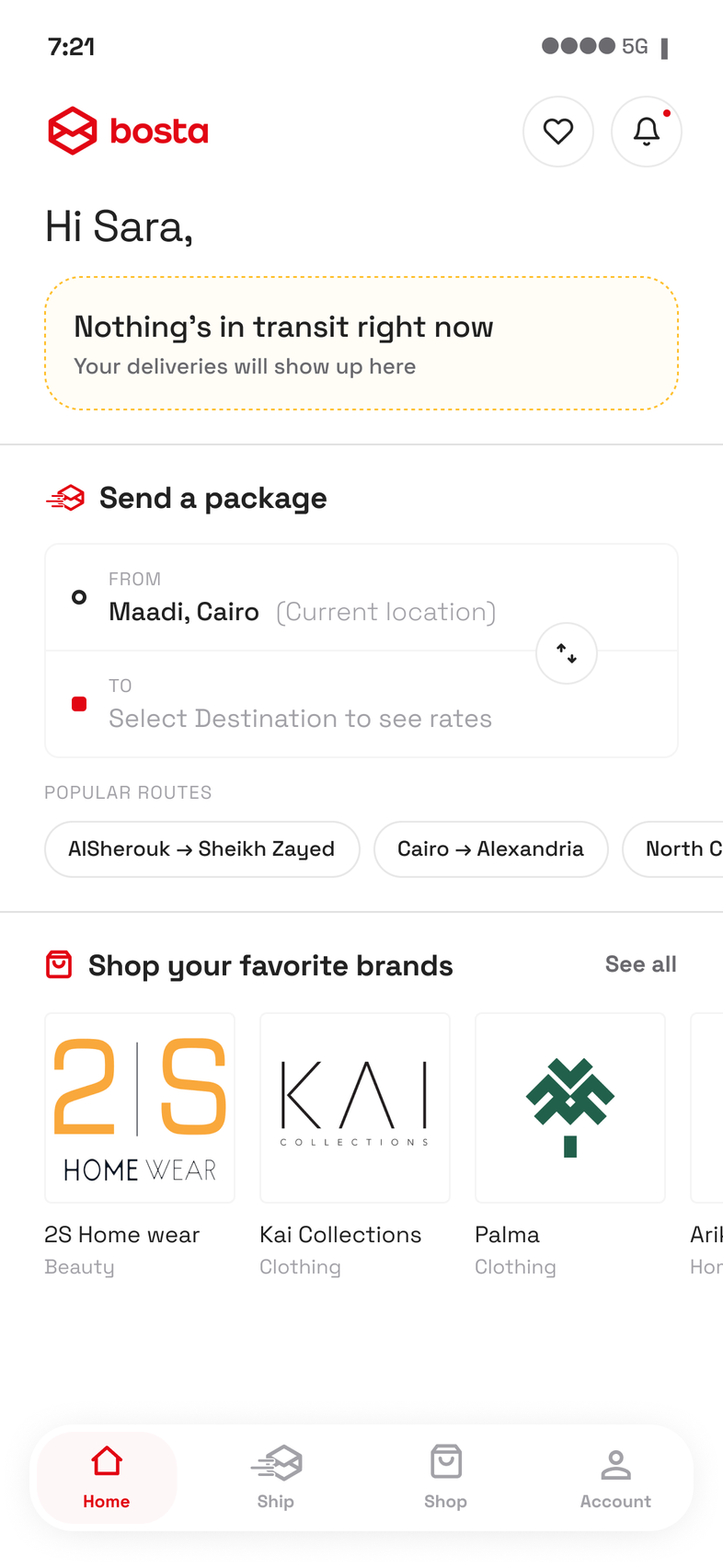
states specified, because one artboard cannot describe a screen that changes
( 01 · The audit )
What was wrong with it
Nothing was broken. Every function was there and everything worked. The problems were in how the screen presented itself and how it spoke.
Alongside my own review of the app, I spoke to Bosta users informally and looked at competitor apps and store reviews.
Four problems came out of it. Each one has a decision further down this page that answers it directly.
( 01 )
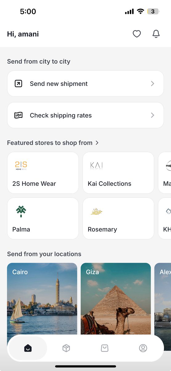
There is no brand in the app
You could open the home screen and nothing told you whose app this was. The logo wasn't there and the brand red barely appeared, so it could have been any tracking tool.
( 02 )
The language isn't conversational
The copy was written from the company's side. Labels described how Bosta is organised internally instead of what the person was actually trying to do.
( 03 )
The shipping options are explained twice
The app told you it ships between cities and also within the same city. Once I showed that, saying it became redundant. The popular route chips now carry the information by example: one route stays inside a city, another crosses between them.
( 04 )
There was a whole button just to see prices
A separate action existed only to preview rates. I removed it and moved the reassurance into the destination field, where the placeholder now tells you that picking a destination shows the rates. You can see it is not a commitment without needing a button to prove it.
( 02 · The real problem )
Two businesses, one screen
Bosta delivers for a large number of Egyptian brands, and was expanding into commerce: selling those same brands directly through the app. The home screen now had to carry two lines of business, and the brief was explicit that neither should come at the cost of the other.
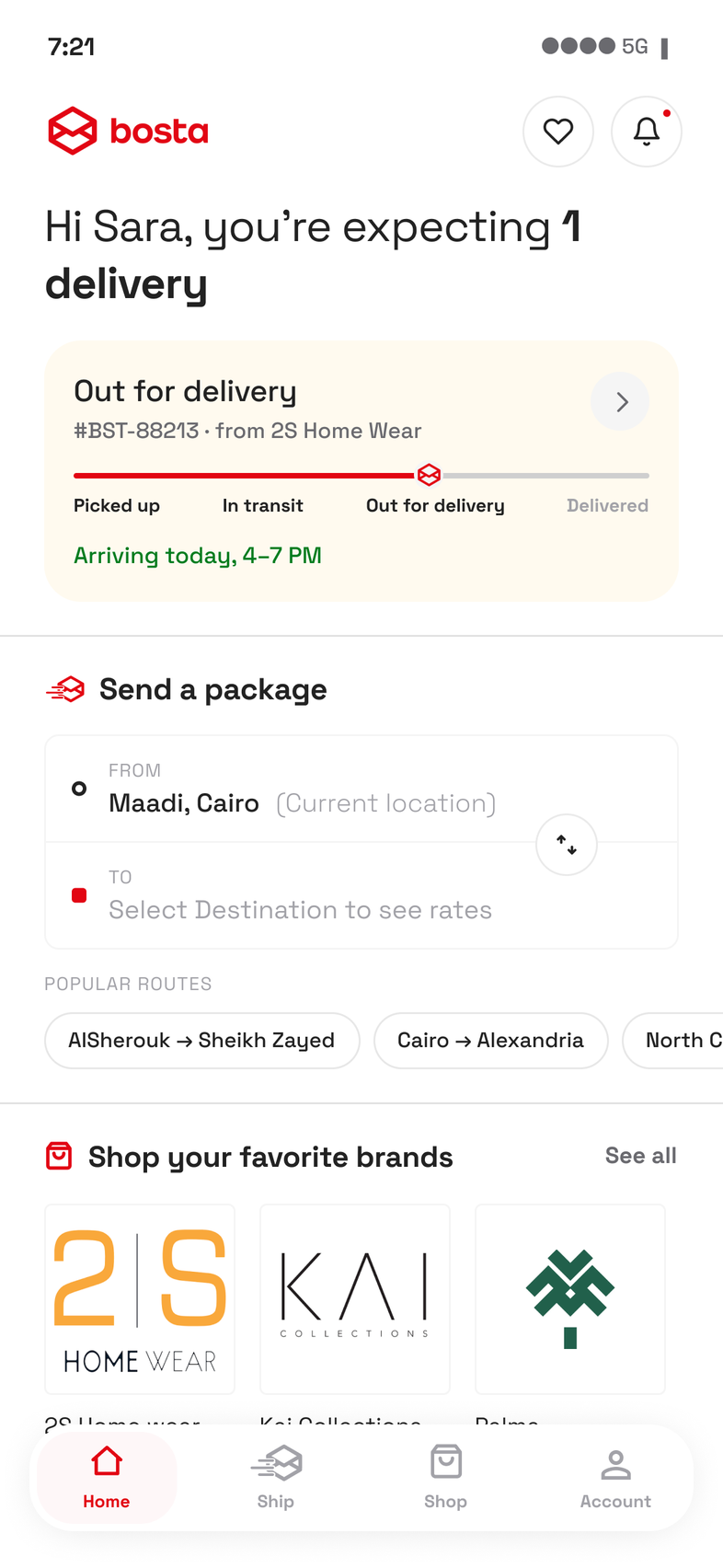
The order follows what people came for. Checking where a parcel is is the most frequent reason to open the app, so tracking answers that first, and its height changes with how much is actually moving.
Sending is second in importance but first in action. It is the earliest point on the screen where someone can do something rather than read something, and it carries the routes Bosta covers, so the destinations are shown by example instead of described in a sentence.
Users do not know Bosta as a shopping app. Commerce is new to the product, so the section's job here is discovery rather than conversion. It still sits above the fold, with a clear title and each store's logo at a size that makes the brand recognisable on sight. That recognition is what makes the section worth browsing at all.
( 03 · The redesign )
What changed
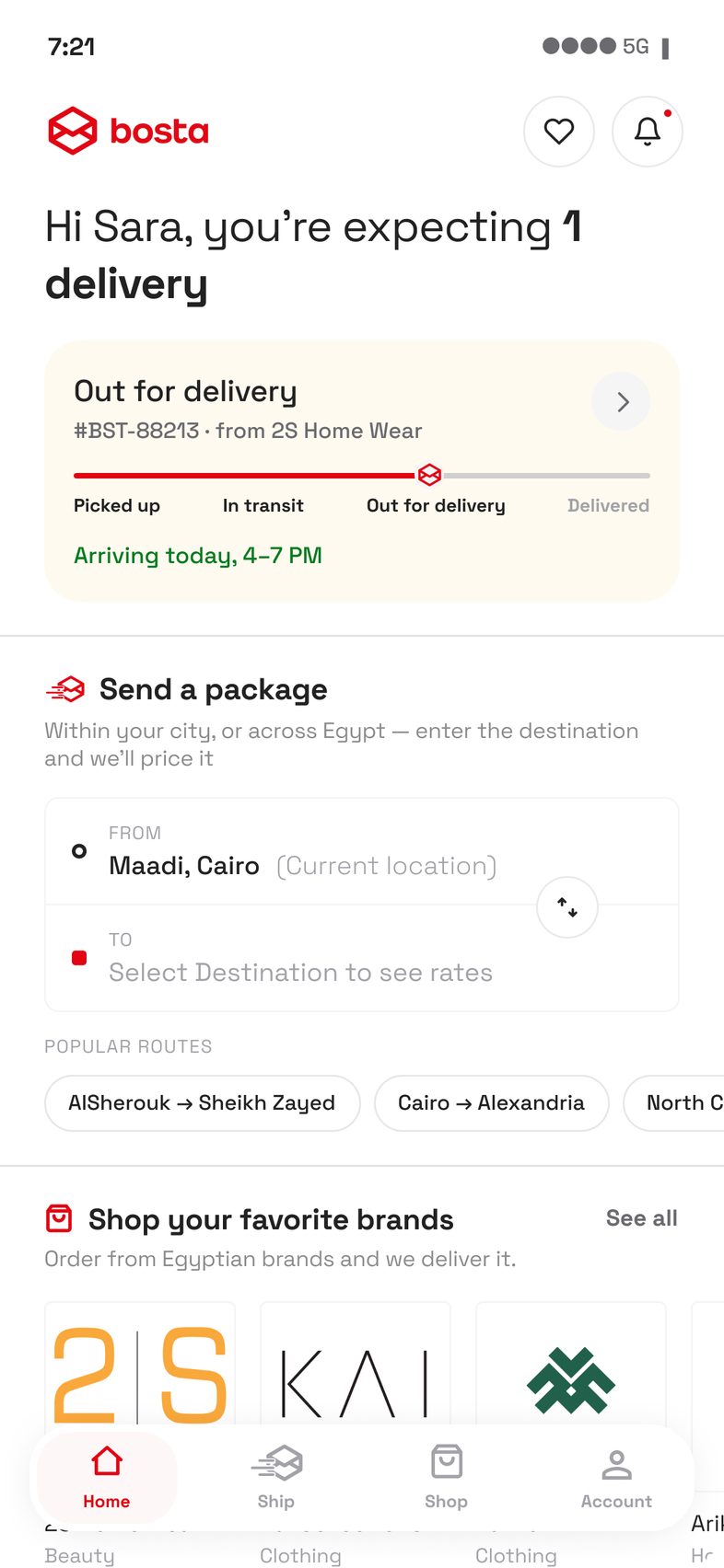
Tracking takes the top of the screen because it answers the question most people opened the app to ask. Someone with a parcel moving wants the status before anything else, so it should not be behind a scroll.
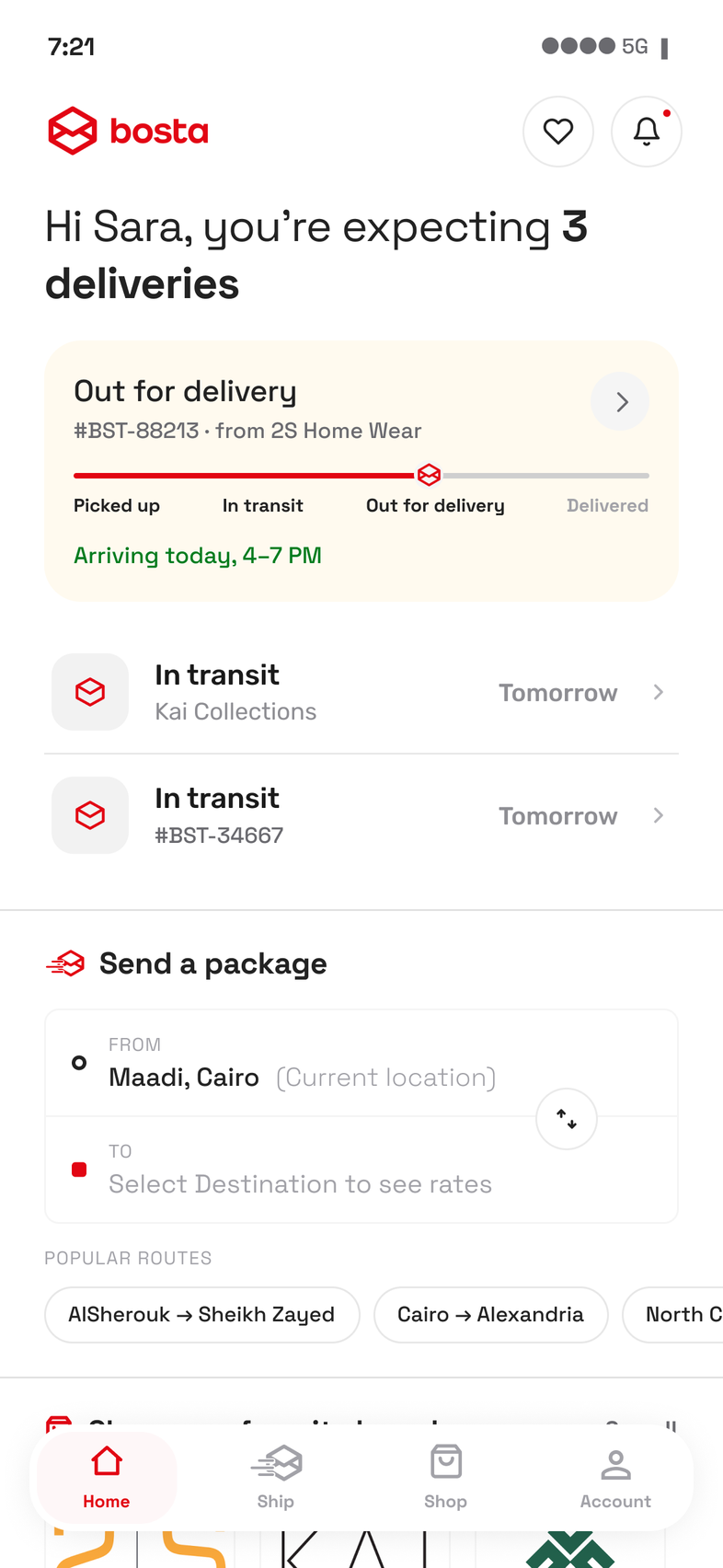
Which is exactly why it needs a ceiling. Past a few parcels the tracking section stops growing and links out to the Ship tab instead. Without that limit, sending gets pushed off the first screen at precisely the moment the user is buying the most, and sending is the business.
The brand is in the app now. The logo sits at the top of the screen and the red runs through the icons, the tab bar and the tracking progress. I added yellow alongside it for status, so status can sit apart from branding rather than competing with it. When something is on its way the first question is when it arrives, so the arrival time gets the most prominent treatment and a colour that reads as good news.
The language is written from the customer's side. The greeting reports their situation rather than describing Bosta's, and the section titles say what a person does rather than how the company is organised: Send a package, Shop your favorite brands. The destination field says that picking a destination shows the rates, which puts the reassurance at the point where the question actually comes up.
Section icons match the navigation. The icon beside Send a package is the one on the Ship tab. The icon beside Shop is the one on the Shop tab. It is a small thing, but it tells people the shortcut and the full page are the same place without anyone having to say so.
( 04 · Onboarding )
The product teaches itself
There is no separate onboarding flow, because most people skip through those without reading them. Each section explains its own function on first use instead.
The important part is what that avoids. Nothing is styled as onboarding, so there is nothing to unlearn later. The layout someone learns on their first day is the same one they keep using on their hundredth, and the teaching lines simply stop appearing once they are no longer true.
( 05 · Every state )
The same screen has a different job in every state
The brief was one screen. But a home screen is not one design, and handing over a single artboard would have left the hard parts undecided. What the screen has to do changes with who opened it and what is moving: a first time user with nothing to track needs something different from someone with five parcels mid delivery.
So I specified it across both axes, at every point where the layout has to behave differently. Nothing reorders between them. The order someone learns on day one is the order they keep, and the teaching lines simply stop appearing once they are no longer true.